
Redesigning the
Disney Experience
The most magical place on Earth deserves an app that feels like it. This one doesn't — yet.
Note: This is an unsolicited concept project. Kyle Thiboutot has no affiliation with The Walt Disney Company. All Disney marks and references are used for educational and portfolio purposes only.
I've been going to Disney parks my whole life. I know every shortcut, every hidden gem, every golden hour shot. The app has never kept up with how much I know — or how much it could learn about me.
The most beloved brand in the world has one of the most frustrating apps.
The My Disney Experience app tries to do everything — park maps, wait times, dining reservations, Lightning Lane, photo passes, hotel bookings, character meet-and-greets. The result is an app that does everything adequately and nothing brilliantly.
Guests arrive at the parks overwhelmed. They spend their first hour staring at their phone instead of looking up at Cinderella Castle. The app creates friction in a place specifically designed to eliminate it.
This project is my answer to that. Not a skin swap — a fundamentally different way of thinking about what a Disney app should do and when.
Guests don't go to Disney to use an app. They go to feel something. The app should get out of the way and let that happen.
One experience. Two surfaces.
The same design language — dark, cinematic, personal — carried across desktop and mobile. Planning on the big screen. The park in your pocket. Same guest, same trip, seamless handoff.
Desktop — the planning canvas. Rich, immersive, built for pre-trip preparation.
Mobile — the park companion. Focused, fast, built for the moment you're standing in the park.
An app trying to be everything
- Navigation is buried 3–4 levels deep for common tasks
- No personalization — same experience for first-timers and 50-visit veterans
- Planning features disconnected from in-park experience
- No social layer — you can't share your day with the people you're with
- Photos, plans, wait times all feel like separate apps stapled together
- Zero intelligence — doesn't learn from you or anticipate your needs
The Audit · Phase 01
First, I had to understand
what was broken.
Before a single pixel of the redesign was drawn, I audited the current app systematically — not just as a designer who's frustrated with it, but as a Principal UX practitioner with 20 years and an NN/G Master Certification behind every observation. What I found confirmed the feeling. 37 findings. 5 critical failures. A design system that never quite became one.
Selected findings
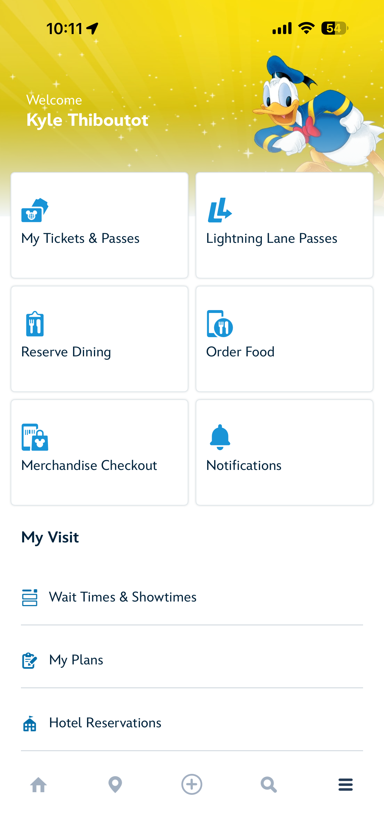
The app runs three distinct navigation systems simultaneously — a bottom nav quick grid, a hamburger menu, and a "+" action sheet modal — with overlapping and contradictory content across all three. "Order Food" appears in both the grid and the action sheet. "Reserve Dining" and "Check Dining Availability" appear to be the same destination with different labels. There is no rule a guest can learn to predict where anything lives.
Consolidate to a single coherent IA. Every destination exists in exactly one location with exactly one label. The "+" button does one thing consistently.
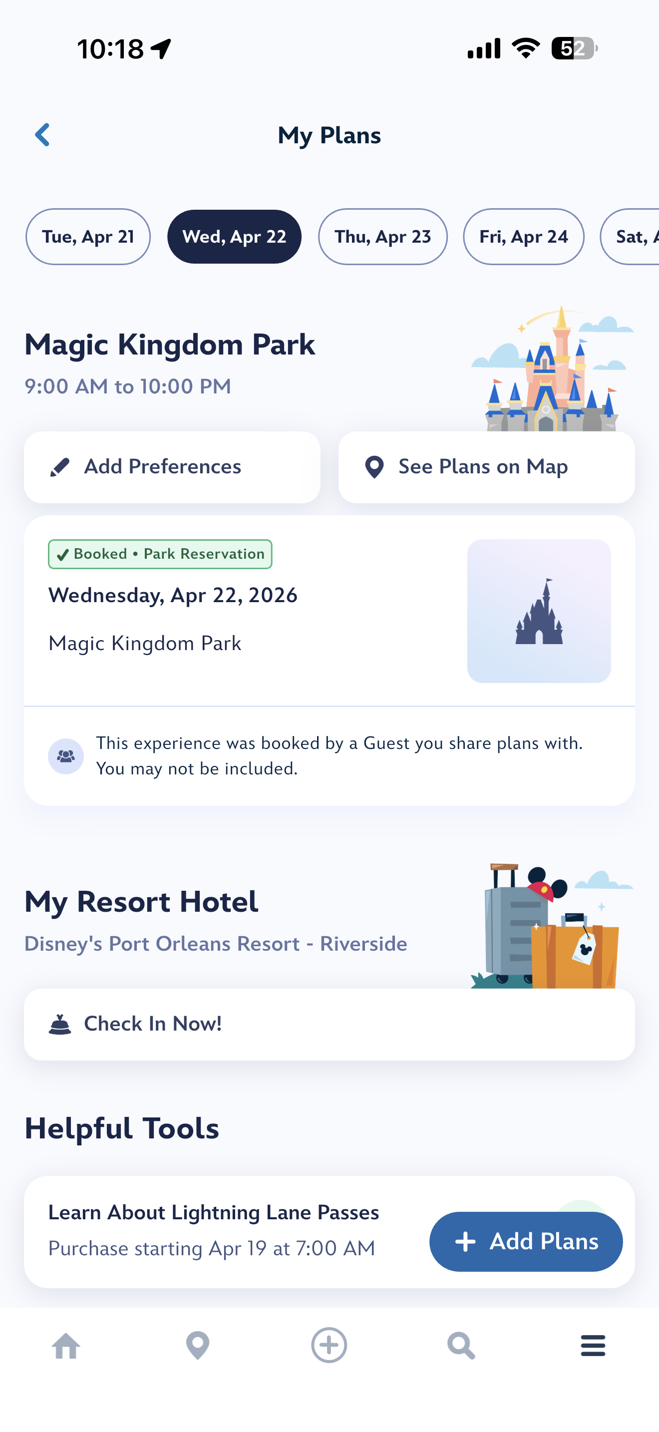
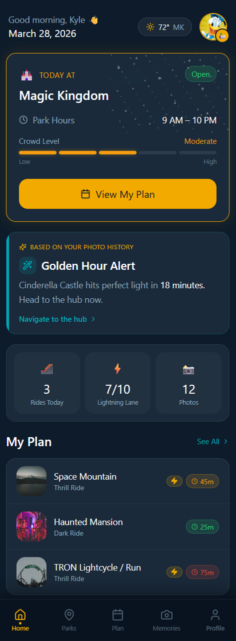
The My Plans screen buries reservations and trip details beneath promotional content and generic help prompts. A guest opening My Plans on the morning of their park day should see their complete itinerary front and center — instead, key information requires scrolling past content that isn't relevant to their day.
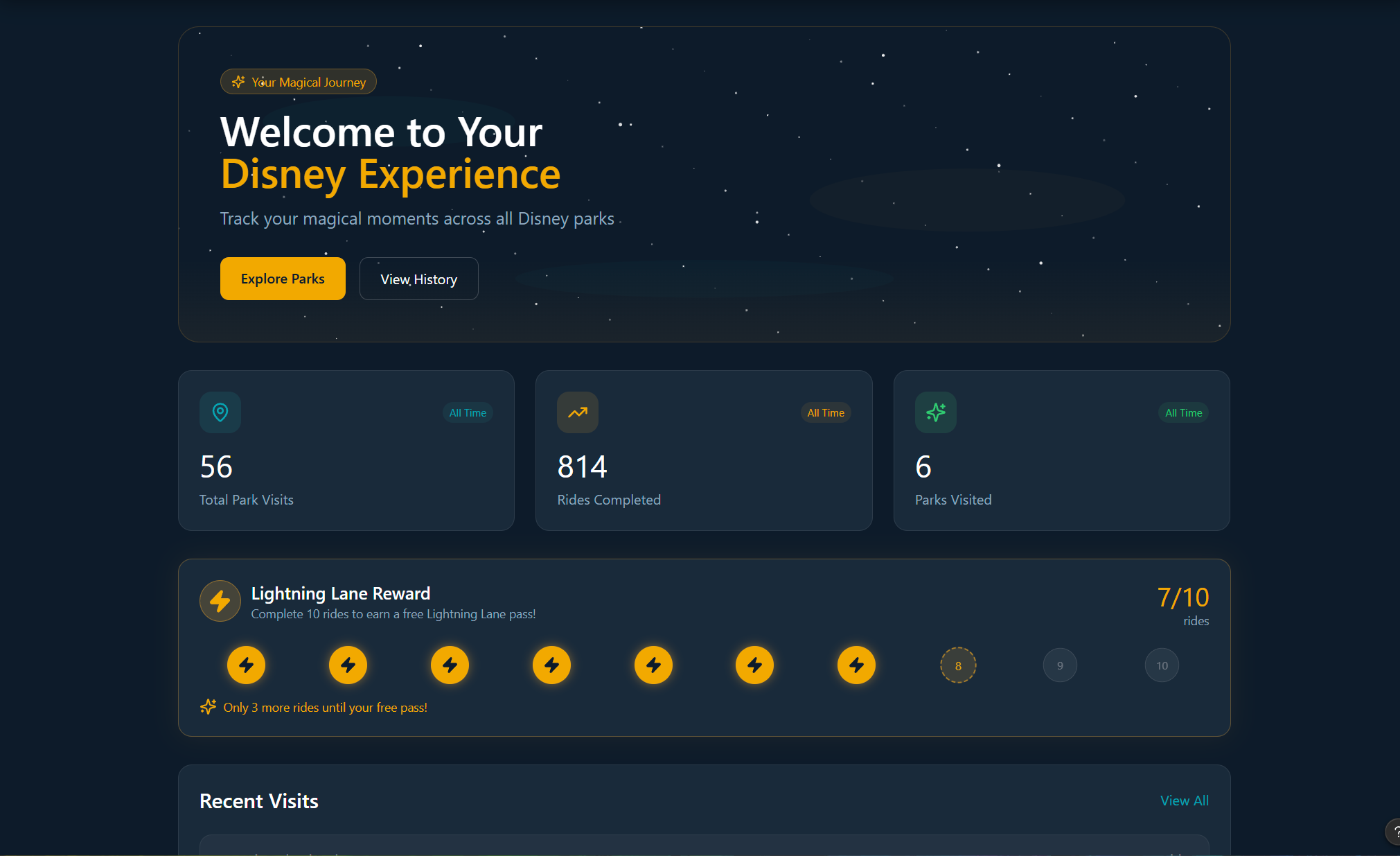
Transform My Plans into a genuine day-of command center. Surface in time order: park reservation, Lightning Lane return windows, dining reservations, virtual queue status. This is the single highest-impact UX improvement in the application.
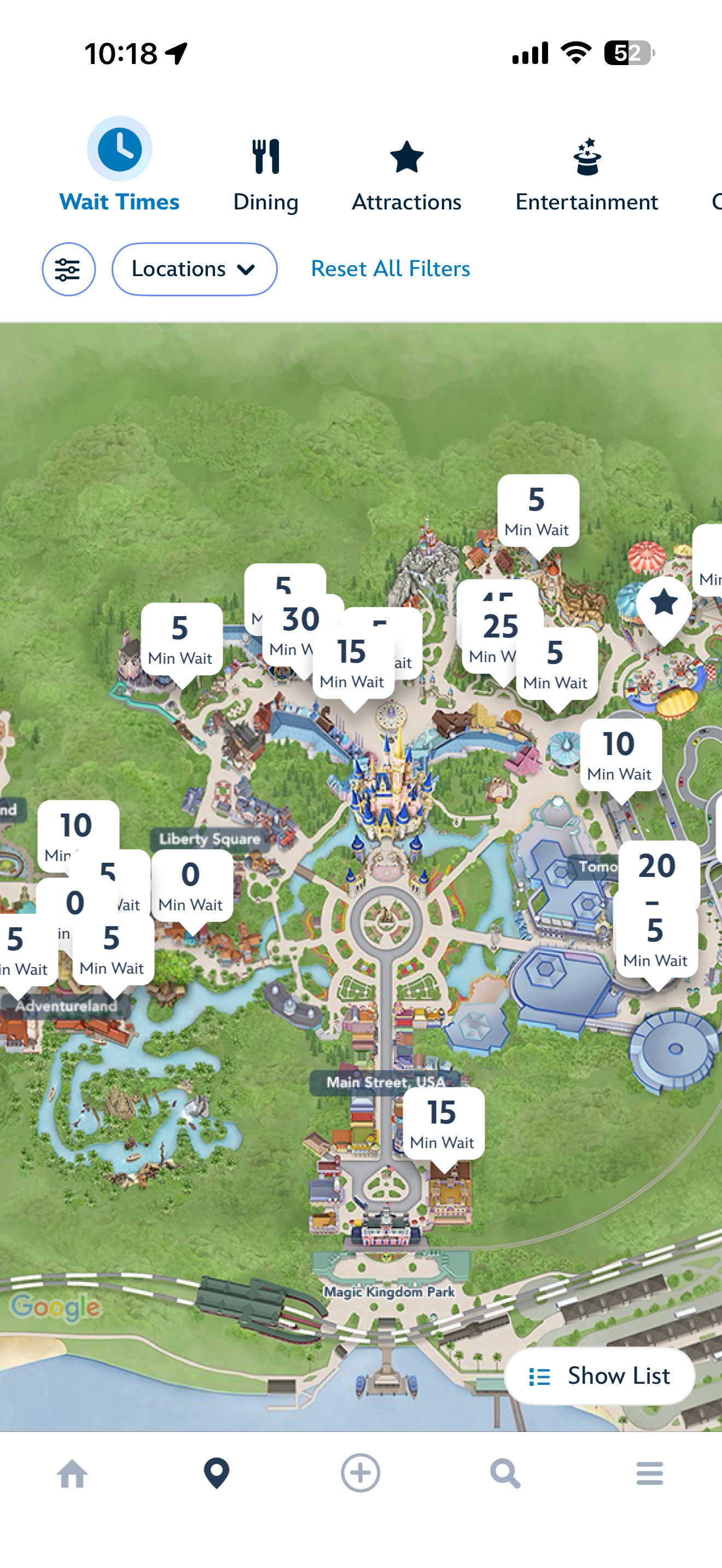
With Wait Times active, the Magic Kingdom map displays 18–20 simultaneous callout cards that severely overlap in Fantasyland and Adventureland. Attraction identity is completely lost in clustered areas. A guest cannot determine which attraction has a 30-minute wait from the map alone. The map's core purpose — spatial orientation — is defeated at the zoom level where it's most useful.
Implement cluster consolidation at zoom levels where callout density causes overlap. Collapse nearby POIs into a grouped count bubble that expands on tap. Add attraction name to each card so it is actionable without a secondary tap.
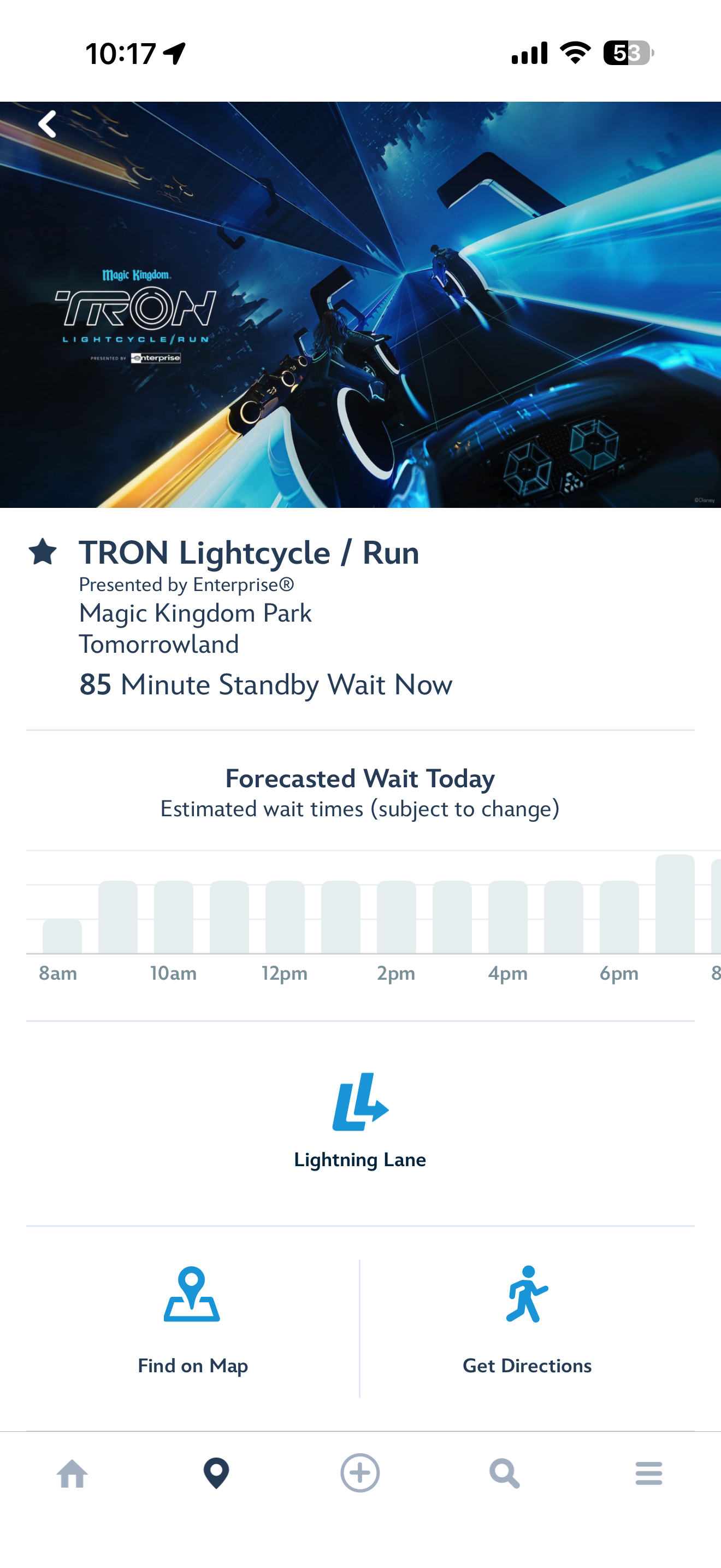
The Forecasted Wait Today chart shows bars of varying height with no Y-axis labels, no current time indicator, no color scale, and a clipped rightmost bar. A guest cannot tell what the tallest bar represents in minutes, which bar is "now," or whether conditions improve in two hours. The chart communicates relative — not absolute — wait time, making it a visual decoration rather than a decision tool.
Add Y-axis labels at 30-minute increments. Add a "Now" indicator line. Apply a traffic-light color scale. The data is already present — only the presentation needs fixing. This is the highest-leverage quick win in the app.
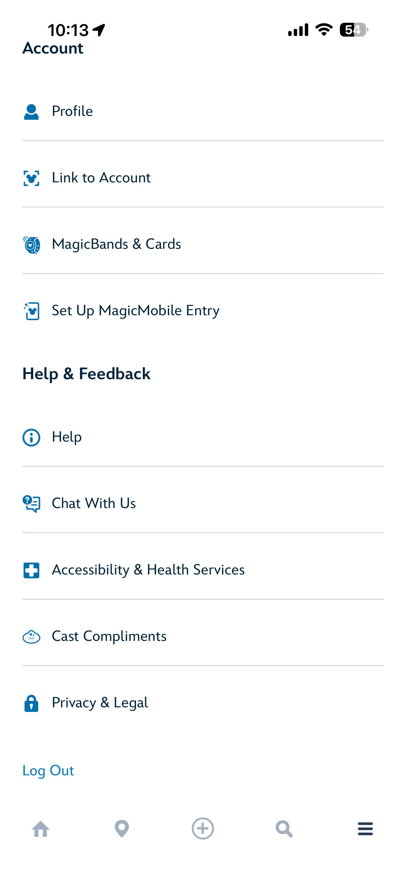
Accessibility & Health Services is the fifth item under Help & Feedback — the last section of the hamburger menu. A guest using a wheelchair, managing a sensory-sensitive child, or requiring medical accommodation must scroll through Profile, MagicBands, MagicMobile, Help, and Chat to find this option. For a park serving millions of guests with disabilities annually, this placement carries both a usability and an ADA accommodation risk.
Surface at the top level of navigation. First item in a Guest Services section, or pinned at the top of the hamburger. It must not be subordinated to Help & Feedback under any redesign scenario.
Five things that could ship this week.
No architectural changes. Under one week each. Immediate impact.
Two hours of engineering. Eliminates the most fundamental navigation ambiguity in the app. Ship immediately.
Front-end only. The data is already there. Transforms a decorative graphic into a real decision tool.
"TRON — 85 min" instead of "85 Min Wait." One line of text. Eliminates a mandatory tap for every guest.
Configuration change. Immediately surfaces relevant results for in-park guests instead of alphabetical EPCOT hotels.
One day of work. Impact: every guest with accessibility needs, every visit.
Full audit report — 37 findings, complete recommendations.
Every finding. Every severity rating. Every recommendation. Available as a complete PDF document.
One experience. Three phases.
How I approached it
The planning canvas.
A Disney trip starts months before you arrive. Park days to choose, dining to book, hotels to compare, the day you'll meet Cinderella to plan around. That work doesn't fit on a phone. It needs a screen big enough to hold the whole trip at once.
Desktop is where anticipation lives. Side-by-side park comparisons. Calendar views that span four days. Itineraries shared with the people you're traveling with — kids picking rides, partners debating dinners, all on the same plan. The mobile app picks up the trip when you walk into the park. The desktop builds it.

Trip overview — the full itinerary, at a glance.

Park exploration — built for the pre-trip planning hours.
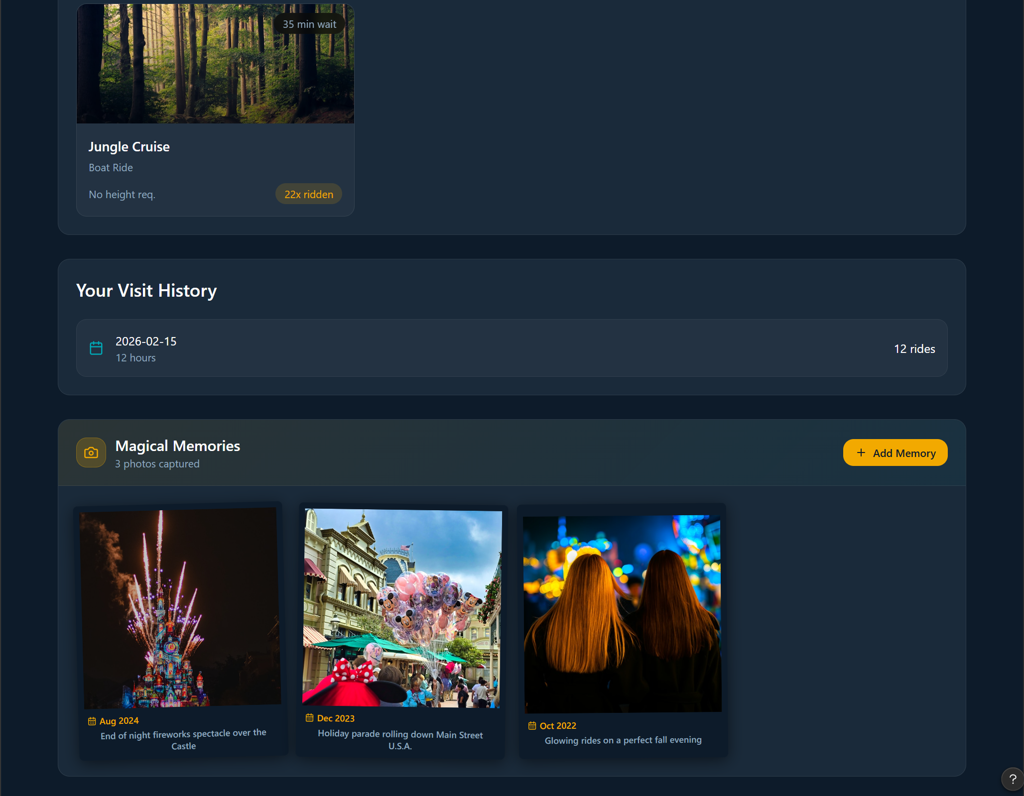
The app that learns you
The biggest gap in the current Disney app isn't the design — it's the intelligence. Disney knows more about their guests than almost any company on earth. None of that shows up in the experience. The redesign introduces a personalization layer that gets smarter with every visit.
A Disney app that feels like Disney.
This project is ongoing. The concept proves that a fundamentally different approach is possible — one that starts from the guest experience rather than the feature list. The next phases focus on the web planning canvas, social sharing with your group, and expanding the AI personalization layer across all three journey phases.
Designing without constraints
Experience it yourself.
The full interactive prototype is in progress — built in Figma Make with real interactions and time-of-day theming. Coming April 22nd.
View Prototype — Coming April 22nd